
AMAZON AALIA
How to help asthma sufferers cope better
How an application and a paired device can best support its user with prescription refills, their environment, and anxiety.
Mobile Application
The Brief
Amazon Aalia is a "hypothetical" combination of a wearable patch and mobile app that will help people monitor and manage their asthma. Aalia’s greatest value to the market comes via wearable technology that allows users to track their vitals and other signs that could contribute to asthma at anytime.
We were tasked in developing an MVP for this brand new application to help asthma sufferers cope with their everyday struggles and symptoms.
My Role
Our team consisted of three UX Designers and a Researcher. My role early on was to delegate responsibilities using a Miro board as well as conducting daily team stand ups. My other responsibilities were to conduct my own market research, develop our primary persona, and prioritised the initial list of features.
Along with the Researcher, we procurred, facilitated and executed numerous in person and remote interviews. Then as a group we synthesised, ideated, prototyped and tested the MVP.
Timeline: 2 weeks
Team: A Researcher and three UX Designers, including myself
Responsibilities: Miro board, Discovery, Synthesis, Ideation, UI Design (photo capture), Testing
The Reality of Asthma in Australia
“With at least one person dying each day in Australia as a result of their asthma, despite the majority of these deaths being preventable, it's imperative that those with asthma arm themselves with the knowledge and tools they need to breathe better.”
https://www.sbs.com.au/news/breathe-better-on-world-asthma-day
In Australia the prevelance of asthma is higher than anywhere else on the globe, with one in nine people suffering from the condition. The toll this has on families and the medical sector is massive, with 40,000+ hospitalisations annually and only 15% of those polled in a study conducted by Asthma.net finding the condition "manageable".
Understanding the Landscape
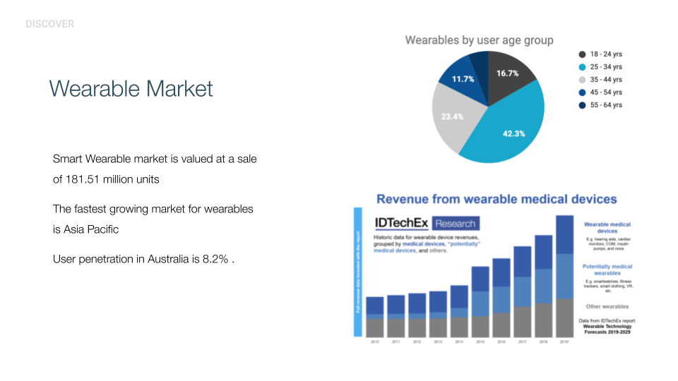
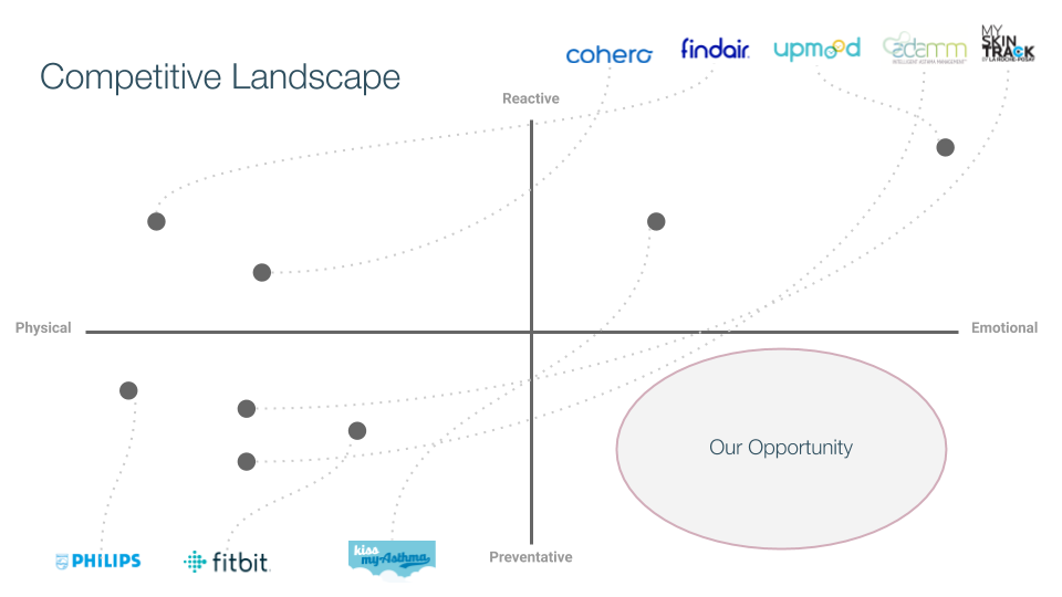
We discovered that the wearable market is vast and there were a number of competitors in the asthma sector. We began to look at where the best opportunity would be by mapping out the Competitive Landscape. It became apparent that there was room in the Emotional + Preventative space. Understanding this also helped us frame some of the questions we would ask our interviewees.
So who did we talk to?
[overview]
We spoke to a mix of Users and Stakeholders from 16 to 42 years old ,including four parents of children with asthma, and three medical professionals (Doctor, ER Nurse, Paramedic). We then charted the quantitative data.

What were Users feeling?
[Qualitative Analysis]
Concerns about medication
With the majority of our target audience being millenials with busy life-styles we found their main concern centered around medications. Having their reliever inhalers with them when leaving the house, medications expiring and the need for prescriptions and refills.
"I have to think about my medications everytime I leave the house"
"My Anxiety about my asthma can actually be the trigger that brings on an attack"
Anxiety and asthma
Concerns about medication preparedness leads to a high occurence of anxiety. Being prepared for an asthma attack is a constant worry for the user.
Our goal here is to help the user be prepared and in turn avoid the anxiety they were currently dealing with.
Anxiety and asthma
Concerns about medication preparedness leads to a high occurence of anxiety. Being prepared for an asthma attack is a constant worry for the user.
Our goal here is to help the user be prepared and in turn avoid the anxiety they were currently dealing with.
27
mentions of medication related issues
19
mentions of asthma anxiety
The User Groups
We began to group our Users into three different types:
1. The anxious parents of an asthmatic child, 5 - 15 years old.
2. The anxious asthmatic - busy, unprepard and needs a lot of help with management, 22 - 37 years old.
3. The anxious asthmatic - busy, prepared but needs some help with management, 22 - 37 years old.
We discussed the user and business needs and agreed that it was best practice to focus on the early adopter first. Who would be willing to try a new application to better their management? Group three became our primary persona.
The Primary Persona we designed for
The Primary Persona we designed for


Problem Statement
Asthmatics need a way to feel confident about managing their condition so they can break out of the cycle of anxiety.
Problem Statement
Asthmatics need a way to feel confident about managing their condition so they can break out of the cycle of anxiety.
This got us thinking...
How might we empower Allen to feel secure in his day to day management so that he may live a less anxious life?
The Insights & The Development
With the numerous mentions of "asthma anxiety" resulting from medication unpreparedness, we felt we understood Allen's pain points and were ready to move into the development phase of the project. We facilitated three rounds of Crazy 8's and Design Studio to ideate a number of solutions that would help Allen with his day to day management.
Feature Prioritisation
Our ideation process produced a number of thoughtful and important feature possibilities. We considered them by inserting each into this Importance/Feasibility Chart to help us decide which would be the most beneficial for our user, while considering the business goals.
They included:
1. Medical alerts (prompting user needs to take medication)
2. Environmental alerts (related to users triggers)
3. Prescription alert (automatic refills + doctor visit)
4. Automatic prescription delivery
5. Emotional check-in (after event)
6. Attack alerts (for others around you)
7. Trigger data
8. Journal (voice)
9. Chat (Support)
10. Treatment video (education)
One through five became the core functions.
Feature Prioritisation
Our ideation process produced a number of thoughtful and important feature possibilities. We considered them by inserting them into this Importance/Feasibility Chart to help us decide which would be the most beneficial for our user while considering the business goals.
They included:
1. Medical alerts (prompting user needs to take medication)
2. Environmental alerts (related to users triggers)
3. Prescription alert (automatic refills + doctor visit)
4. Automatic prescription delivery
5. Emotional check-in (after event)
6. Attack alerts (for others around you)
7. Trigger data
8. Journal (voice)
9. Chat (Support)
10. Treatment video (education)
One through five bacame the core functions.

The Core Functions
1.
Medical Alerts
A warning alert when the Users monitored vital signs are outside of their normal range and the possibility of an asthma event is approaching. This will enable them to use preventative measures.
2.
Evironmental Alerts
A notification about environmental conditions that may trigger an attack for the User. Taking into account the ones that our interviews deemed most likely to have an effect on their asthma.
3.
Presciption Alert (automatic refills + Doctor visit)
A notification for the User to see a doctor and refill prescriptions that are going low or are about to reach the expiry date.
4.
Automatic Prescription Delivery
A presciption upload system within the app which will also allow for delivery options removing the need to visit a pharmacy.
5.
Emotional Check-In
An in-app check-in that allows the User to rate how they are feeling after an attack and keep track of their progression over time.
Paper Prototyping
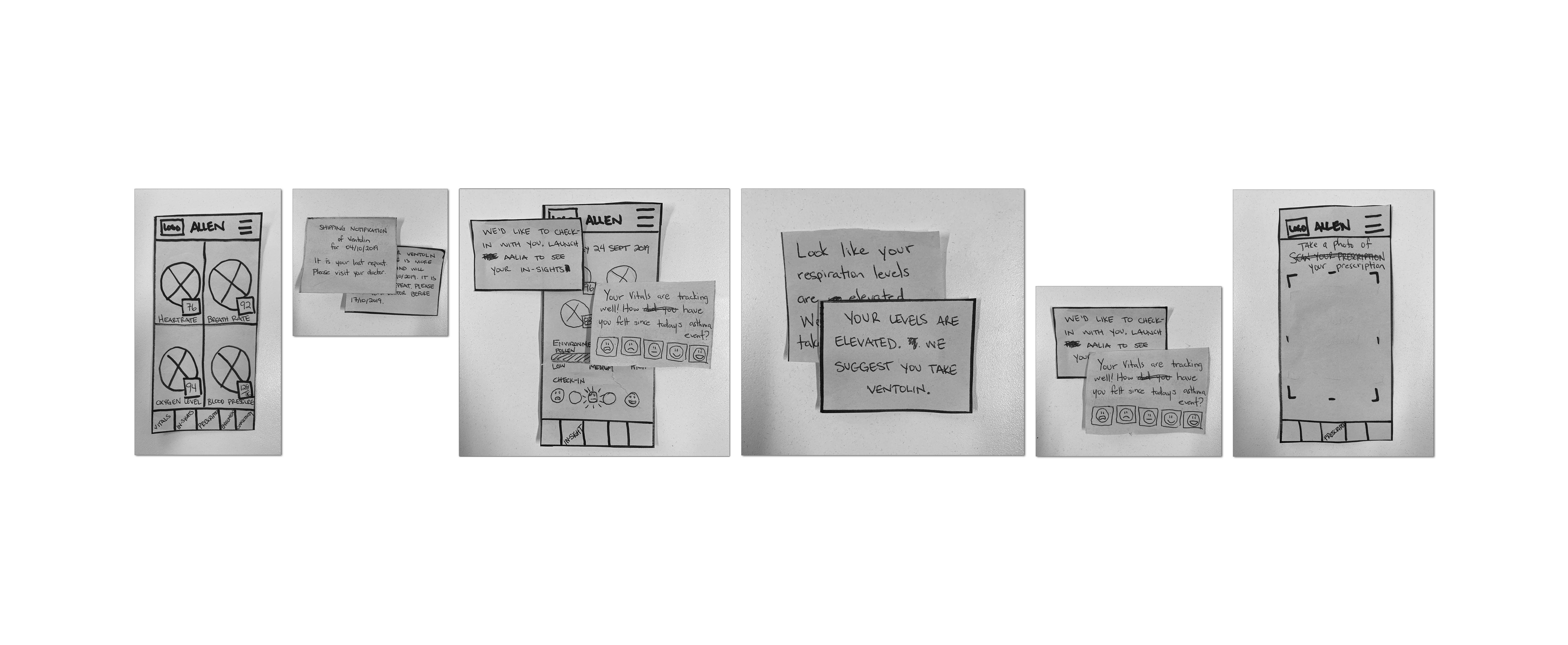
We began with a user flow and a clear scenario to help our prototyping process. We then created a wireframe and went to paper and pen in order to test and iterate quickly.

Testing & Iterations
Testing & Iteration
We tested with 8 users and found three key take aways.
Copy, Timing, Context.
The copy and tone of voice around the automated shipping notification was not perceived as friendly enough. We adjusted it to sound more conversational.
The emotional check-in feature felt invasive to some of our Users. They found it to be mis-timed and some were confused by the copy. We decided to use icons for clarity and made adjustments to the copy, the timing and frequency, for clearity and comfort.
We tested with 8 users and found three key take aways.
Copy, Timing, Context.
The copy and tone of voice around the automated shipping notification was not perceived as friendly enough. We adjusted it to sound more conversational.
The emotional check-in feature was not given enough context early on. Users found it to be mistimed and some slightly confused by the copy. We decided that the users needed a full introduction to the feature in the onboarding process as well as adjusted the copy, the timing and the frequency for clearity and comfort.
Onboarding and App Tour

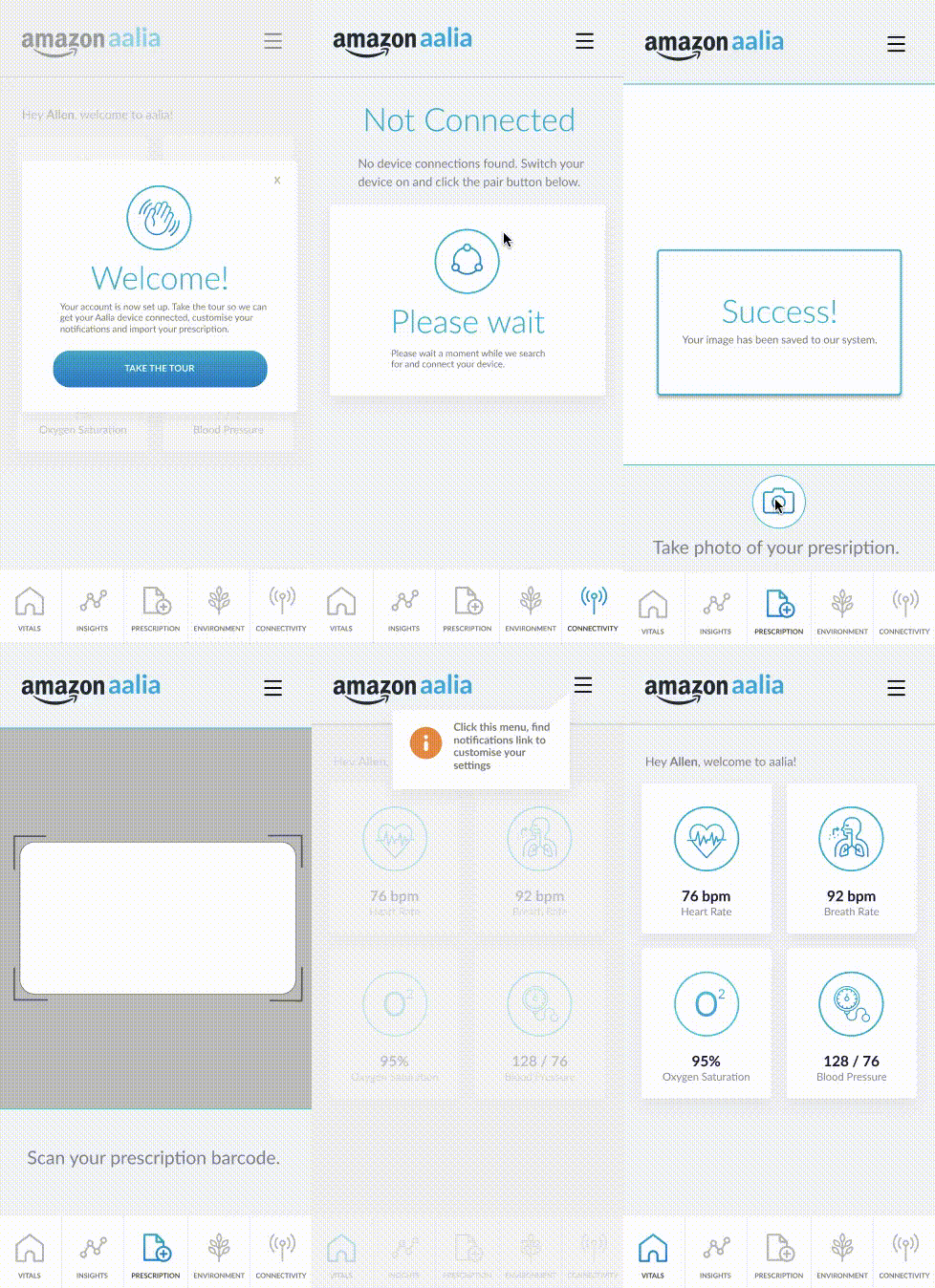
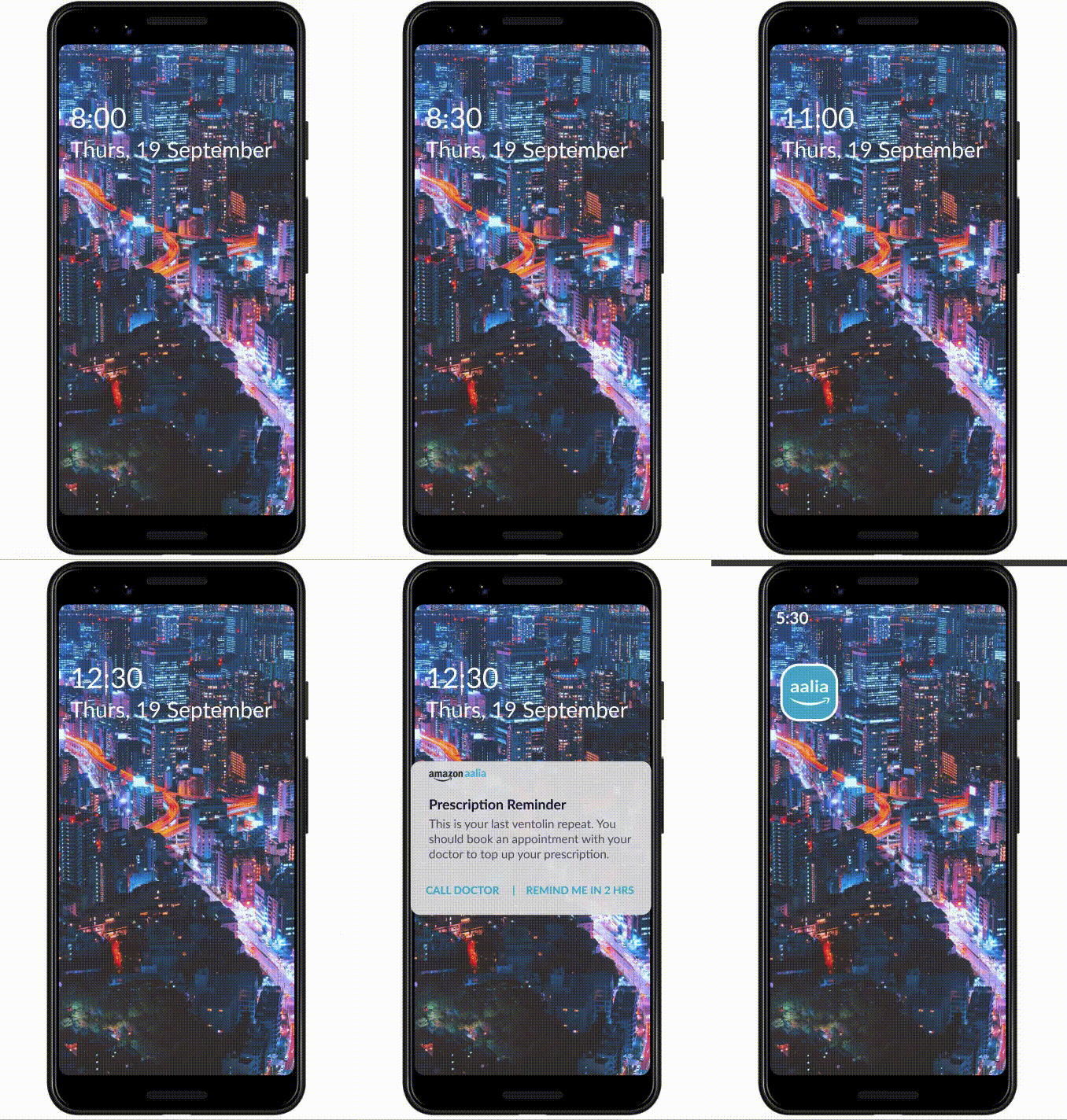
Notifications for environmental warnings, prescription alerts and medication alerts
Notifications for environmental warnings, prescription alerts and medication alerts
Notifications for environmental warnings,
prescription alerts and
medication alerts
Prescription refill feature
and delivery service
Prescription refill feature
and delivery service
Prescription refill feature
and delivery service

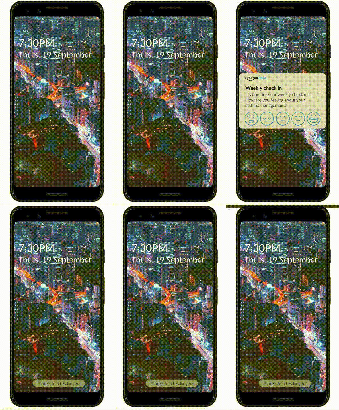
Emotional check-in feature
Emotional check-in feature
Emotional check-in feature
My Retrospective
1.
Fail fast
Iteration and discussion took up a lot of our very short schedule on this project. We learned quickly that failing fast and testing early was the most informative course of action. The users will decide what works best for them.
2.
Know what's possible
Research into current technologies and laws is key. What is possible in the market you are designing for? We had lofty plans that we found would not meet business goals with insurance laws in Australia, sending us back to the drawing board.
3.
Timing is Key
The delivery of copy and the timing in which it's delivered is key for the User's understanding of call to actions further along in their interaction with the app. We missed some key explanations before they became apparent during testing.
Thanks for reading!
Let's talk about it!
©2020 Alyas Mawani
